A new data area
It is finally happening
I nevertheless postponed the integration for a long time. The obstacle was not so much the availability of data as Climate Chronicle itself. Its existing structure was strongly geared towards weather stations and monthly readings. Glacier data work differently: observations are often annual or cover longer periods and may describe the movement of a glacier front between two survey dates. Before I could present these data sensibly, I first had to make some fundamental changes to the existing structure.
That is exactly why the subject remained on my list for so long. Now it is finally here. Looking back, I am very glad about it because glaciers fit the existing view surprisingly well. They add another long-term perspective to the weather-station data and make a development visible that, for me, absolutely belongs in Climate Chronicle. Glaciers can be opened, filtered and compared in station selection. One direct example is glacier AT_gl_481; the national view is available through the Climate Chronicle glacier map.
Particularly helpful is the excellent availability of data from the World Glacier Monitoring Service, or WGMS. Its Fluctuations of Glaciers Database contains internationally standardised data from many countries, including coordinates, length changes, area, elevation, volume changes and mass balances.
For Climate Chronicle this is a major advantage: once the processing is in place, the integration is not limited to Austria or a handful of selected glaciers. Existing countries and glaciers can be added using the same principle. Alongside weather stations, this creates a second major data area. That was the point when it became clear to me that glacier retreat simply belongs here.
Different data, a different sense of time
From individual values to a longer development
Until now, Climate Chronicle has mainly been based on monthly readings. For every month there is, where available, a specific value from a weather station. Glaciers work differently.
A typical observation describes how much the glacier front changed between two surveys. A value of minus 54 metres therefore does not mean that the glacier lost 54 metres in one particular month. It means that its front retreated by 54 metres in total between two observation dates. It quickly became clear to me that these data must not be artificially distributed across months.
A single annual value is interesting. For me, the development only becomes truly clear when many observations are connected. This is why I also accumulate the individual length changes. Retreats of 20, 30 and 40 metres become the total change since the beginning of the series; a small advance in between is included as well. This turns many individual surveys into a long-term development line. The original observations remain unchanged, while the cumulative view is simply an additional presentation within Climate Chronicle.
Not every value represents one year. Many glaciers provide regular, almost annual series, but observations may also be several years apart. A value covering three years therefore remains exactly that: a change over three years. I do not distribute it retrospectively across individual years or months. Where no observation exists, I do not create an artificial intermediate value. This follows a basic principle of the project: missing data remain missing data.
Context: The glacier metric describes changes in the position of a glacier front. It is neither a monthly change nor a direct measurement of mass balance.
More than numbers
The numbers are not the whole story
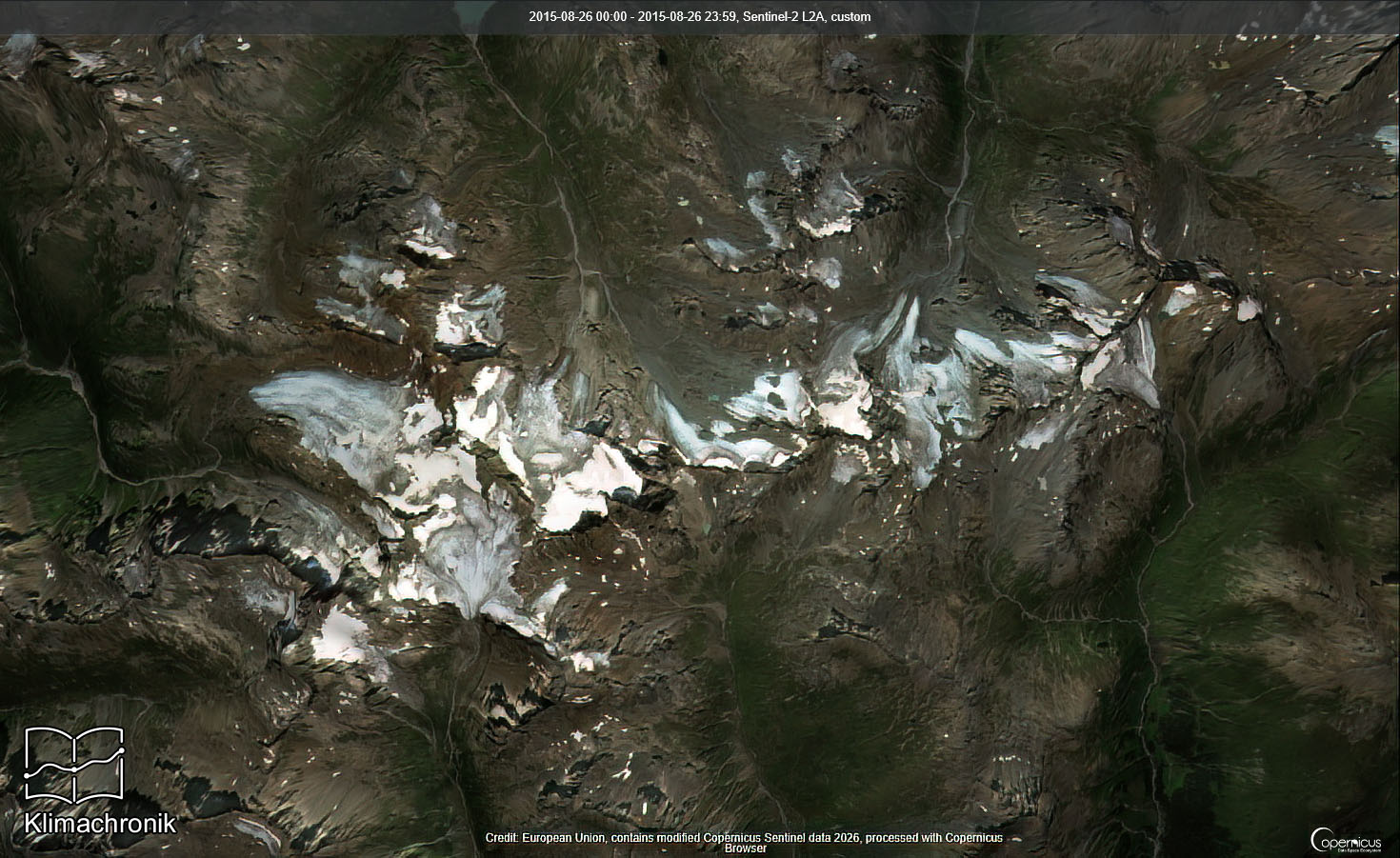
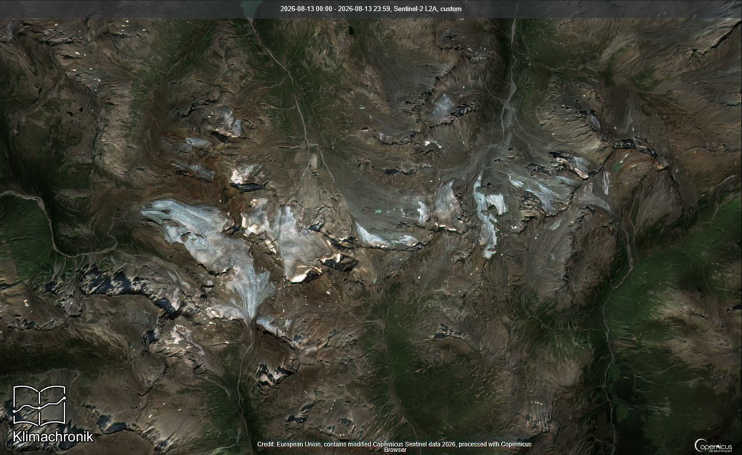
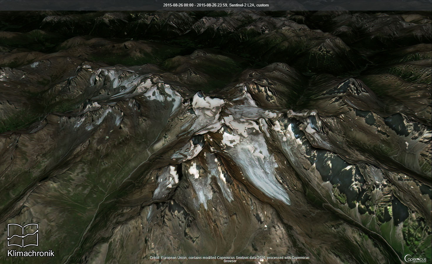
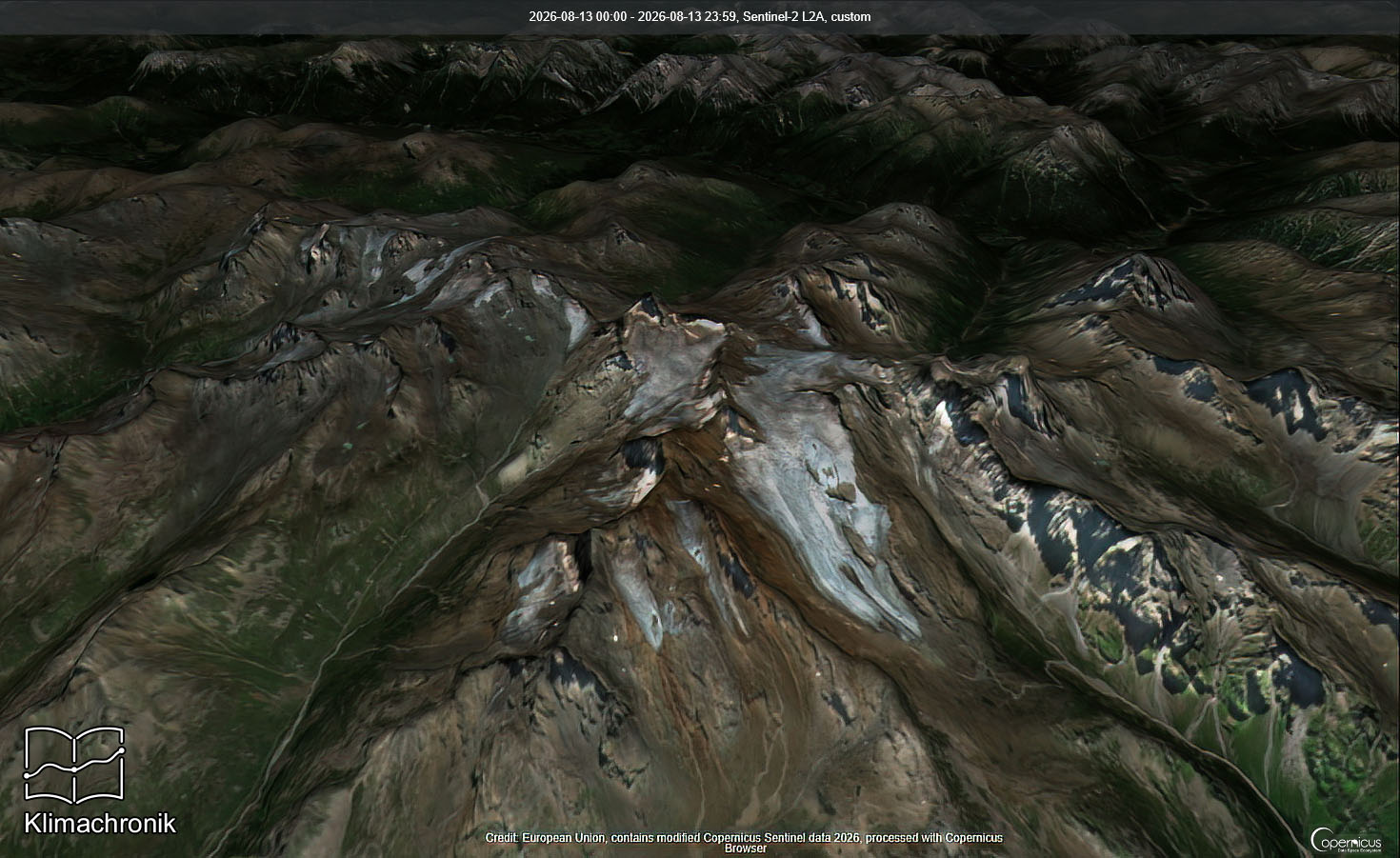
With the measurements alone, I quickly realised that something was still missing. Numbers show very well how much a glacier has changed, but an image often makes that change more immediate. This led to the idea of adding before-and-after images to the glacier views.
At first I considered using real photographs. Finding suitable images for hundreds of glaciers, locating comparable photographs taken from similar viewpoints and then checking sources and usage rights would, however, be extremely time-consuming. I remain open to photographs and may add them for individual glaciers later, but I needed a solution that could be applied consistently on a larger scale: satellite imagery.
After my first attempts with Google Earth, I realised that I needed more control over selecting suitable periods and creating a consistent presentation. I therefore moved on to the Copernicus Browser. Copernicus is the European Union Earth-observation programme and provides extensive, freely usable geodata and satellite observations. Sentinel-2 is especially useful here: its optical data have comparatively high spatial resolution and work well for landscapes, snow, ice and glaciers. Since 2015 it has provided regular imagery, making changes over several years visually traceable.
Manual selection and my own processing
The idea was simple, the implementation less so
At first the process seemed straightforward: select satellite data, compare suitable years, use the images, done. In practice, it quickly proved to involve a considerable amount of work. Many queries could be automated through an API, but important uncertainties remain: the exact framing, whether the scene really works and, above all, cloud cover. An otherwise suitable date can quickly become unusable because of clouds, shadows or seasonal snow.
I therefore make this selection deliberately by hand. I check each frame and look for scenes with little cloud cover from comparable periods. I favour late-summer imagery, especially August and September in the Alps, when seasonal snow has usually melted back furthest and less of the glacier itself is concealed. This takes time, which is why I will add the comparisons gradually instead of trying to equip hundreds of glaciers at once.
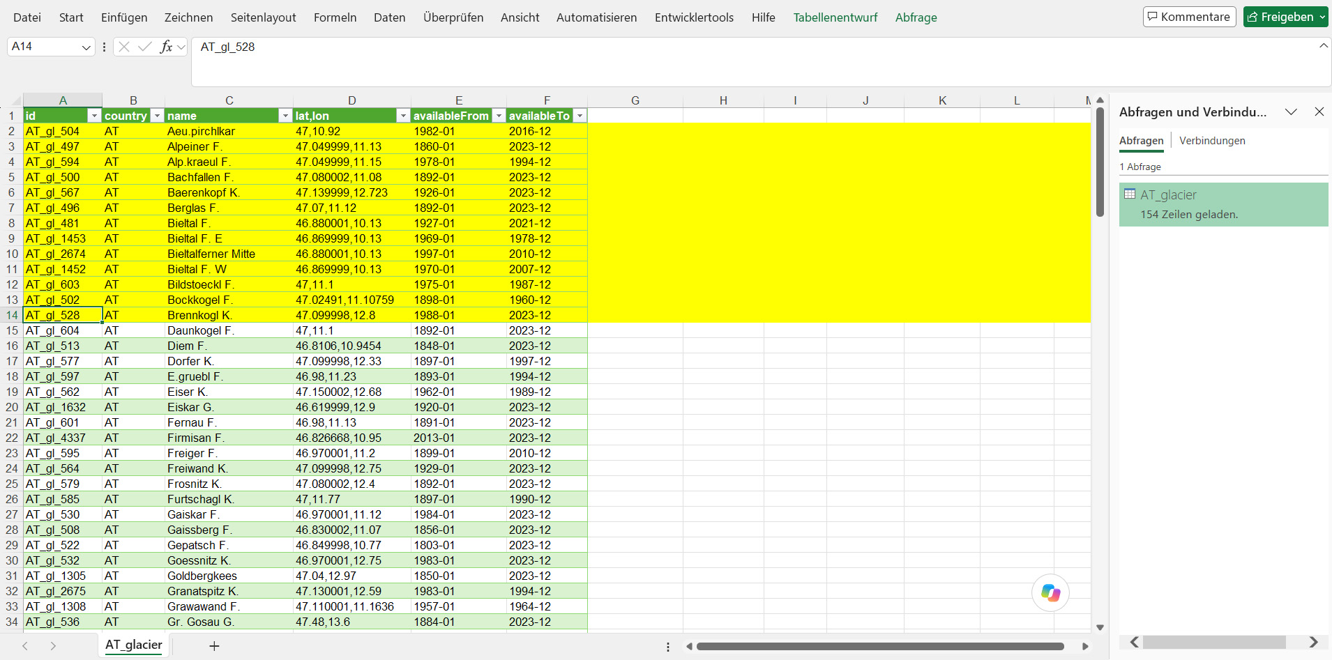
My local Excel overview brings together the information relevant to selection in Copernicus Browser. It helps me match a glacier, suitable years and the comparison period carefully. The following views show my workflow from the data overview to manual selection in the browser.
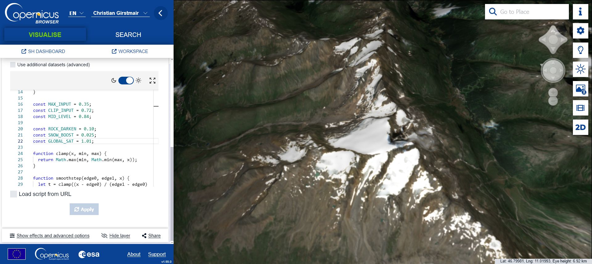
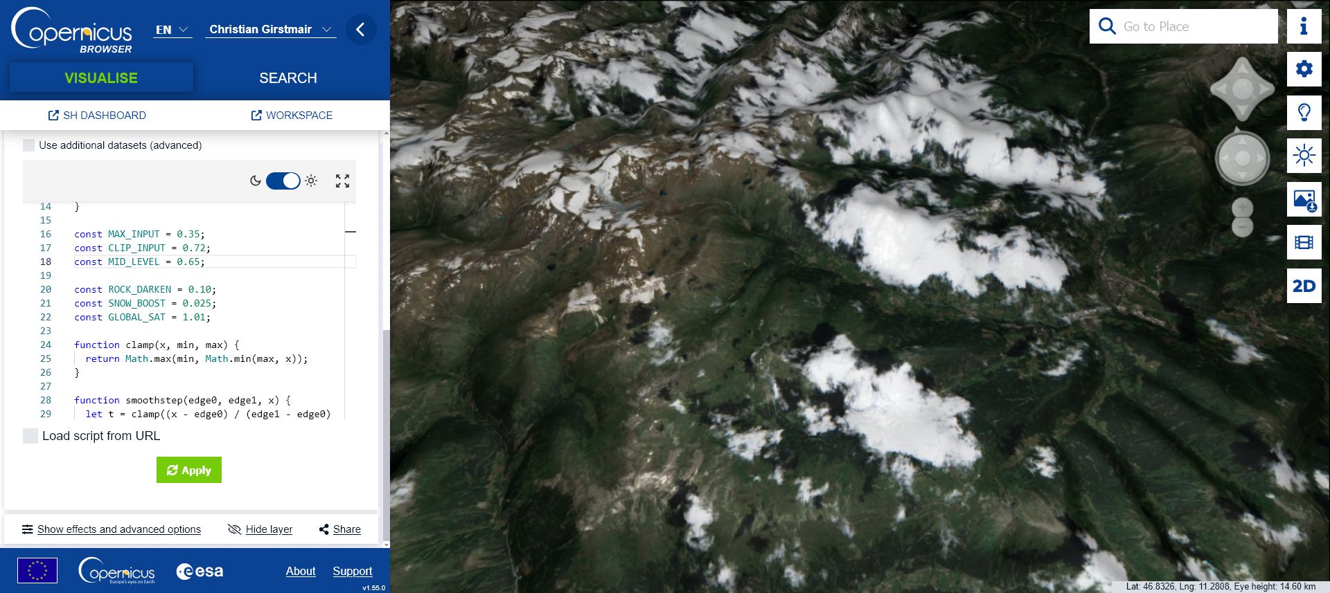
I do not use the Sentinel-2 images unchanged. I created my own Copernicus script that keeps mountains, rock and the surroundings realistic while making the whole scene slightly darker and the glacier surfaces easier to see. The result is a set of before-and-after images that can be compared clearly. The Copernicus script is available for download below.
The work is not quite finished after the Copernicus export. I run the images through Photoshop for a final adjustment of contrast, legibility and overall appearance. I prepared a separate script for that step as well, and the Photoshop script can also be downloaded below. My aim is not an artificially coloured analysis view, but a clear and useful rendering of the actual landscape.
This gives the glacier integration a second layer. The historical measurements show how strongly a glacier changed over years or decades, while the visual comparisons make that change immediately visible. This combination of measurements and imagery is what I find particularly compelling about the new glacier view.
What comes next?
A section that will grow step by step
For me, glacier integration is not a completed block but a new and growing area of Climate Chronicle. The data foundation is in place, the first display logic is working and the image comparisons will be added step by step. Because their selection and processing take time, I deliberately want this part to grow gradually.
I think that is rather fitting. Glaciers do not tell their story through frantic fluctuations, but through slow, clear changes over long periods. That is exactly the development I want to make visible in Climate Chronicle.
Further reading and downloads